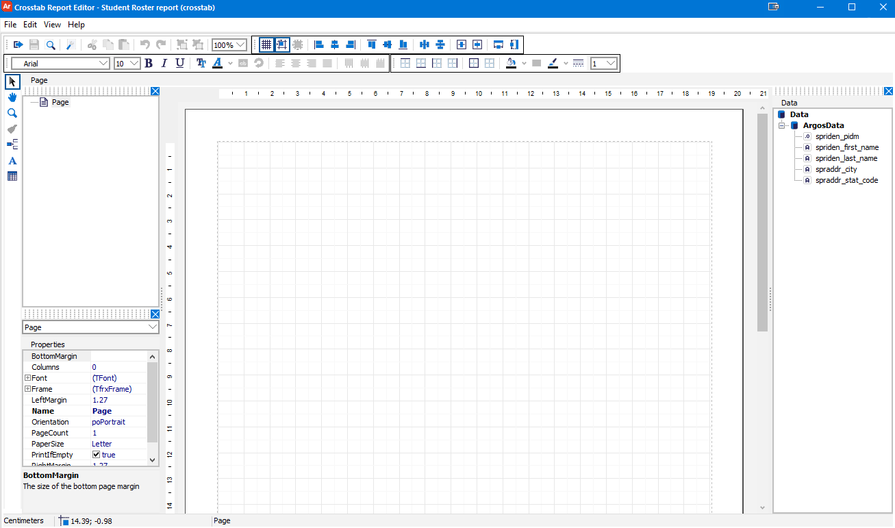
Crosstab Report Editor - Main Screen
The Crosstab Report Editor is where you design the layout of your report and construct the crosstab object using the data from the report query.
Toolbars
The Crosstab Editor has four toolbars across the top of the screen, and a vertical object toolbar on the far left.
Object Tools
The Object toolbar contains tools for manipulating objects and adding objects to the report.
| Icon | Name | Description |
|---|---|---|
|
Select | The standard cursor used for selecting objects. |
|
Scroll Document | Turns the cursor into a hand that allows you to pan (scroll) around the report without selecting objects. |
|
Zoom | Turns the cursor into the Zoom cursor. When this cursor is active, left clicking on the report zooms in, and right clicking on the report zooms out. You can also use the Zoom dropdown in the Standard toolbar to change the zoom level. |
|
Copy Format | Copies the format of the currently selected object, and turns the cursor into the Format Painter. Clicking on other objects will "paint" them with the same formatting (colors, font, etc.) as the selected object. |
|
Insert Band | Add a title band, page header band, or footer band to the report. Report title bands appear once at the beginning of the report. Page header bands appear at the top of each page. Page footer bands appear at the bottom of each page. As you add objects to the page, the page footer band automatically moves so that it is always below the crosstab and does not overlap other objects. |
|
Add Text Object | Add a text object to the report. Text objects are multi-line memo fields that can be resized, positioned, and formatted using the toolbar options. See Crosstab Report Editor - Database Text Fields for information on including expressions and database text in your crosstab report. |
|
Draw Crosstab Object | Add a crosstab object to the report to display data from the report query. Click anywhere on the report to add the object. The Crosstab Editor dialog will open, where you can choose the desired fields from your source data and drag the desired fields into the lists of rows, columns, and measures. |
Standard Tools

| Icon | Name | Description |
|---|---|---|
|
Close the Editor | Closes the Crosstab Editor window. |
|
Save Report | Save your changes. The icon is grayed out if nothing has been modified since the last save. |
|
Preview | Preview how the report will look when populated with data from the report query. Argos will display the dashboard for you to choose parameters, and allow you to choose how many records to show in the preview. |
|
Page Settings | Edit page settings such as the paper size, orientation, and margins. |
|
Cut | Cut the selected object(s) to the clipboard. |
|
Copy | Copy the selected object(s) to the clipboard. |
|
Paste | Paste object(s) from the Clipboard into the currently selected location. |
|
Undo | Undo the last action. |
|
Redo | Redo the previously Undone action. |
|
Group | After selecting multiple objects by Shift-clicking or by drawing a box around the desired objects, grouping them together allows you to move them as a unit. |
|
Ungroup | When a group is selected, ungrouping it separates the individual objects back to their original components. |
|
Zoom Dropdown | Change the zoom level to make the editor appear larger or smaller on your screen. |
Note: Drafts are temporary saves that occur automatically while working in dashboards, banded reports, and crosstab reports. Drafts do not overwrite manual saves, so it is still suggested to save your work often. For more information please see Drafts.
Alignment Tools

| Icon | Name | Description |
|---|---|---|
|
Show Grid | Toggle the display of the grid lines in the editor. Enabled by default. |
|
Align to Grid | When enabled, objects can only be positioned alongside the grid and will snap to the closest grid line. Disable this to allow more fine-grained manual positioning. |
|
Fit to Grid | Adjust all existing objects so that they are aligned to the closest grid line. |
|
Align Object Left | Align the left sides of the selected objects with the left side of the object that was selected first. |
|
Align Object Middle | Align the selected objects to the (horizontal) middle of the object that was selected first. |
|
Align Object Right | Align the right sides of the selected objects with the right side of the object that was selected first. |
|
Align Object Top | Align the tops of the selected objects with the top of the object that was selected first. |
|
Align Object Center | Align the selected objects to the (vertical) center of the object that was selected first. |
|
Align Object Bottom | Align the bottoms of the selected objects with the bottom of the object that was selected first. |
|
Space Horizontally | Distribute the selected objects evenly in the space between the left- and right-most objects in the selection. |
|
Space Vertically | Distribute the selected objects evenly in the space between the top- and bottom-most objects in the selection. |
|
Center Horizontally in Band | Align the selected object(s) with the horizontal center of the parent band. |
|
Center Vertically in Band | Align the selected object(s) with the vertical center of the parent band. |
|
Same Width | Resize the selected objects to match the width of the object that was selected first. |
|
Same Height | Resize the selected objects to match the height of the object that was selected first. |
Font Tools

| Icon | Name | Description |
|---|---|---|
|
Font Name | Change the font of the selected text. |
|
Font Size | Change the size of the selected text. |
|
Bold | Make the selected text bold. |
|
Italic | Make the selected text italic. |
|
Underline | Underline the selected text. |
|
Font Settings | Open the Font dialog where you can change the font, font style, size, effects (strikeout/underline), color, and script. |
|
Font Color | Use the dropdown arrow next to the icon to choose from a list of predefined text colors, or use the Other button in the dropdown to define your own. |
|
Conditional Formatting | Configure custom formatting for the field based on the value of one or more variables. You can specify the border, fill color, font, and visibility. |
|
Text Rotation | Rotate the text 0, 45, 90, 180, or 270 degrees within the object. |
|
Align Left | Align the text to the left edge of the object. |
|
Align Center | Align the text to the horizontal center of the object. |
|
Align Right | Align the text to the right of the object. |
|
Justify | Justify the text so that it is spaced evenly across the object horizontally, with no space on either the left or right margin. |
|
Align Top | Align the text to the upper edge of the object. |
|
Align Middle | Align the text to the vertical center of the object. |
|
Align Bottom | Align the text to the lower edge of the object. |
Background and Border Tools

| Icon | Name | Description |
|---|---|---|
|
Top Border | Toggle the top border line of the object. |
|
Bottom Border | Toggle the bottom border line of the object. |
|
Left Border | Toggle the left border line of the object. |
|
Right Border | Toggle the right border line of the object. |
|
Outside Border | Show all border lines around the object. |
|
No Border | Remove all border lines from the object. |
|
Background Color | Change the background color for the object. You can choose from a solid color, fill pattern, gradient, or mirror reflection. |
|
Fill Editor | Open the Frame Editor dialog where you can edit the line style, width, and color; choose which lines should show; and configure a shadow for the object. |
|
Border Color | Use the dropdown arrow next to the icon to choose from a list of predefined border colors, or use the Other button in the dropdown to define your own. |
|
Border Style | Change the border style of the object (solid, dashed, dotted, dash with one dot, dash with two dots, or double solid lines). |
|
Border Width | Change the width of the border for the object. |
Report Tree
The Report tree shows the structure of the report, including any title, header, and footer bands, and all objects that have been added to the report.
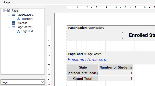
Clicking on an item in the Report tree will select that object on the report.
Data Tree
The Data tree shows the datasets and fields that are available for you to use in the report. The default dataset from the report query is called ArgosData.
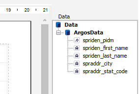
The fields that are available for you to use in your report are listed underneath their datasets. The icon next to each field name indicates its datatype.
Properties Pane
The Properties pane displays a list of properties relating to the currently-selected object. You can use the dropdown above the pane to select an object, or click on the object in the Report Tree or the design window. The properties shown differ depending on the type of item that is selected.
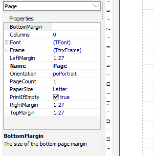
Click on any property to see a description of its purpose. Most properties can be changed by clicking on the value next to the property name.
Page Options
The File > Page Settings menu option allows you to control various page properties for the output.
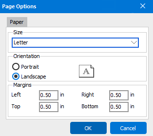
- Size - Choose from common paper sizes including letter, tabloid, legal, statement, executive, A3, A4, A5, B4, and B5.
- Orientation - Portrait (vertical) or landscape (horizontal).
- Margins - Specify the left, top, right, and bottom margin size.
Rulers
The design area includes rulers that you can use for reference as you add objects to your report.
The View > Rulers menu option allows you to toggle display of the rulers.
Guides
You can add horizontal and vertical guides to the design area to help align objects as you place them in the design area.
To add a guide, place the cursor on either the horizontal or vertical ruler, then double click where you want to place a guide. You can right-click on the guide symbol (on the ruler) to delete it.
The View > Guides menu option allows you to control display of the guides. Use the The View > Remove Guides menu option to remove all of the guides from the page.